 |
| Our Modern Monochrome and Mustard Bathroom |
 |
| The BEFORE bathroom pic |
 |
| The AFTER bathroom pic |
I’m sure you’ll agree that this one offers a very dramatic change. The configuration has been completely transformed and the only thing in the same position is the bath. In the same space we've managed to maximise features to also include a new laundry and separate shower. No longer do I have to stand in the tub to shower!
We debated at length about the black tiles as it is quite a bold and dramatic statement, but seeing the finished product, we have no regrets and love the shiny high-gloss black tiles. The running bond tile pattern and white grout highlight the subway tile shape and provides a bit of drama as it really makes the shape and pattern quite pronounced. The high gloss shine tiles and cabinets reflect the light around the room making it feel brighter and bigger. Although the room is very modern with clean lines, the subway tile shape is quite traditional and links to the retro theme through the rest of the house as it is a historical design re-purposed in a modern and fashionable way.
We chose the floating vanity,
cupboard and toilet to give a lighter and more spacious feeling. Losing that
connection to the ground helps gives give a visual illusion of space as opposed
to that heavy grounded and closed in feeling if we were to get units all the
way to the floor.
 |
| Accessories soften the strong design features and give some warmth and personality. |
The grey floor tiles help soften the extreme and bold contrast of the black and white walls. They also introduce a more organic and textured element to the space that is otherwise dominated by the modern, cool and harsh monochrome. The wooden floating shelves also provide some natural softness to balance the rooms cool hardness.
As accent colors we've introduced just a hint of mustard, gold and green in the art and accessories.
With such a stark monochromatic blank palette it was important to bring in some
shots of color.
Our luxurious Citta towels are the perfect color and I love the retro pattern which ties into the rest of our retro home and again offers some interest and contrast to the otherwise very modern and sleek space.
 |
| Original bathroom entry, is now a laundry cupboard |
 |
| The AFTER pic, clean, white and fresh |
 |
| Space economical, all you need for your laundry is a cupboard |
 |
| I created this mood board on Polyvore, see here to purchase the items displayed |
This was my original
mood board made in Polyvore which was quite spot on in terms of the color palette
even though I didn't use any of the light fittings, the feeling is very close. I would recommend using a mood board to get a good picture of what look and style you're trying to achieve. There are so many great tools out there to help you create one, my favs are Polyvore and Pinterest and if you're trying to choose colors try Design Seeds for finding a palette just right for you.
I want to give a special thanks to our talented team of tradesmen who turned this dream into a reality.
Danny – Best builder ever
Herb – Best tiler ever
Stefan – Best architect (and husband) ever
Thanks team, getting clean never felt so good!
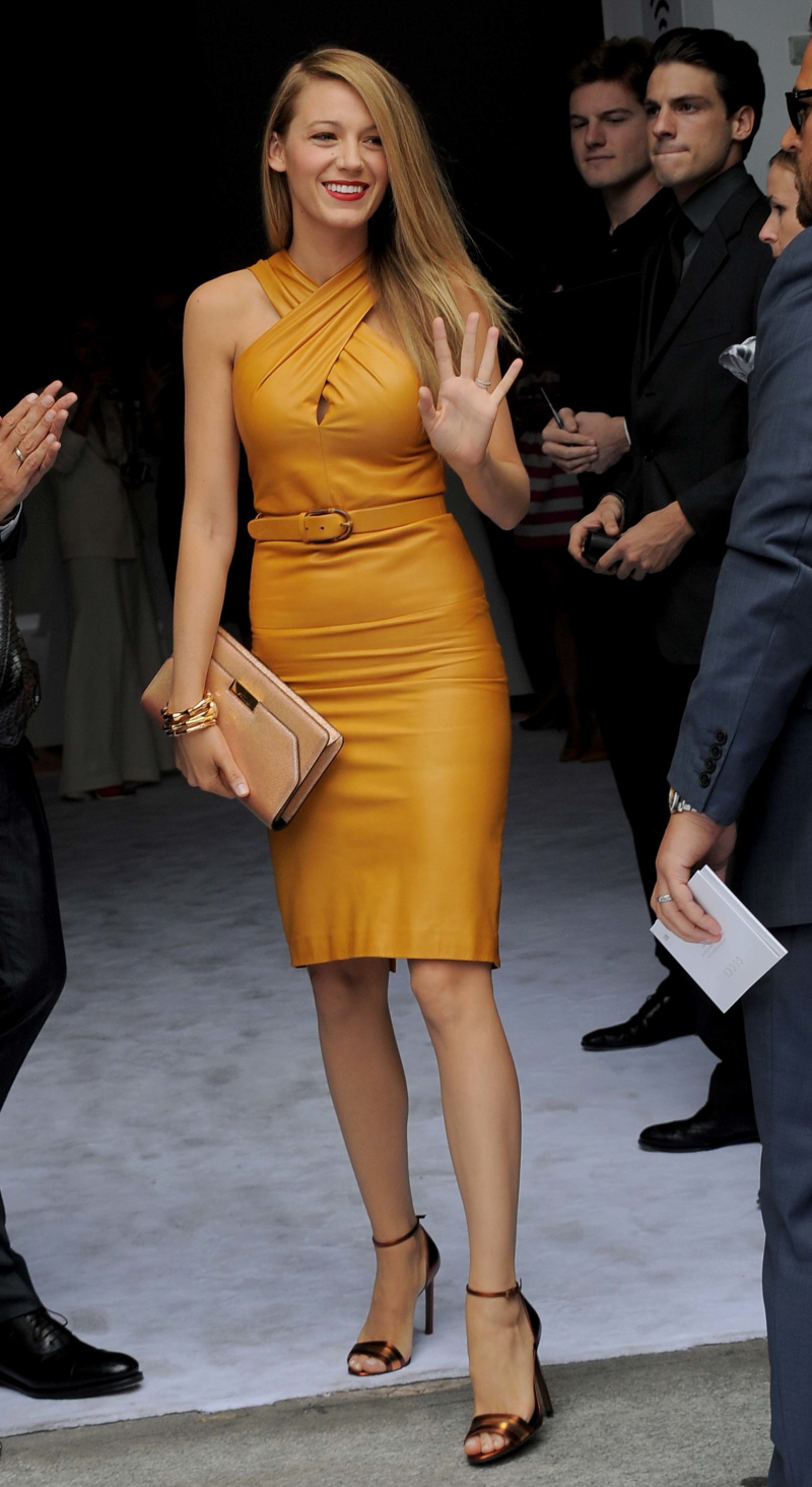
Now to balance out this post here are some Monochrome and Mustard looks to steal...
 |
| Image from shop-hers.com |
 |
| Image from socialbliss.com |
 |
| Image from whowhatwear.com |
 |
| Image from celebitchy.com |
Until next time x


Hochwertiges Schreiben, das mich wirklich zum Nachdenken gebracht hat. Recherchieren Sie dieses Profil CPS Test. Messen Sie Ihre Mausklickgeschwindigkeit mit dem CPS-Tester.
ReplyDelete