Showing posts with label monochrome. Show all posts

We love neon!

Friday, 22 November 2013


Left image Erena Te Paa (me) and right image my house via alotwithalittle.com

This is me, Erena and thats an arco lamp I painted for my living room makeover.  You don't normally see me in person on the blog but Mereana and I were playing dress ups one day and she snapped this photo of me at her place in one of my favourite colour combinations.  Neon yellow and white.  It's a fresh look and this kind of yellow always brightens my mood.  The white helps to make everything more vibrant creating a stop traffic kind of Pow!  I bought this crop top from a store called Dotti.  If the truth be told it's actually 2 sizes too big for me but I don't like clingy things and I think it still works - it was also ON SALE so no surprises that I just had to get it.  The skirt I bought in Wellington at a secondhand street stall for $20.  I don't know if you can tell but it has pleating right the way around which gives it a little formality and adds a certain retro great gatsby vibe - I actually used it for a gatsby inspired photoshoot I styled recently.

Naturally this colour combination inspired the post as I am more than a bit obsessed with neon accents and namely fluoro yellow neon at the moment, can you tell...


Left image: via  undeclaredpanache.com & right image: via cocokelley.com

I love love love the dress above. The neon limey yellow accent draped along the lower skirt is to die for. I think perhaps the most intriguing thing is the fact that the designer has paired this with a very nude muted palette.  Which if I'd only heard about the dress from just a description I just couldn't envisage it working but clearly it works so well and it gives the dress an edge.  I love bright yellow accents in any space - I did it at my own place with the arco lamp that I painted and it works really well in the eclectic style interior above. 


Left image: via  foxxfoe.blogspot.com & right image: via freshome.com

Fluoro yellow is an of the moment kind of trend and its not something you'll want to throw on everyday but it really does leave other colours in the dust.  I mean why just have a white mini shirt dress when you could have a fluoro yellow mini shirt dress and why just have a white cabinet when you could have a white and fluoro coloured cabinet.  Its just so refreshing.
Left image: via  vogue.com & right image: via desiretodecorate.com

A clawfoot bath in fluoro green is such a great idea for injecting modernity into your space which is especially great if you favour modern spaces while your partner might love vintage pieces.  There is always a way to find balance and merge the two, love it! 


Image via milkfarmroad.com

I couldn't end this post without showing you a simple DIY effect you can do at home.  Dipped bottles, utensils, plates (you name it, if it is tangible you can dip it).  I am definitely trying this one at my place very soon when I take on the kitchen! Simply take your item and proceed to dip it, dip it good, di-dip it real good (note the Salt & Pepa reference) but head to milkfarmroad to get all dipped out with this style tip.

Til next time

Pattern Attack!

Saturday, 7 September 2013

With the change in season I feel inspired to brighten things up with prints and patterns. On trend right now is to be fearless with patterns and prints and to try some bold combinations. Check our previous post how to mix prints to take it to the next level.

I'm a big fan of Porter Teleo's unique wall paper prints so I've dedicated quite a few of this posts image round up to their fabulous print collection.

I love this large red graphic Porter Teleo Wallpaper against the eclectic art and blue accessories. This outfit combination is from the latest  Karen Walker walker range, mixing prints well. Outfit image courtesy of preciouspeg.com
Handpainted Porter Teleo wallpaper in a beautiful colour combo of blues, teals, tans and yellows. Sister Jane Monet dress from asos.com.
We can't have a  pattern attack round up without polka dots. I love the raw texture that the drip effect from the hand painted Porter Teleo wallpaper gives. This is an amazing dress from twentysevennames.co.nz that I'd love to have to welcome in spring.
A more bold example from Porter Teleo wallpaper has a massive impact. This funky outfit from twentysevennames.co.nz is also a great example of mixing prints - pattern and polka dots.
Like pattern and print but not too confident with color? Try grey and white. Porter Teleo wallpaper and dress from asos.com.
Monochromes and grey grahpic prints -  Porter Teleo wallpaper and dress from asos.com.
More floral polka dot Porter Teleo  wallpaper print and the gorgeous floating Mondegreen tee and maxi skirt.
Porter Teleo aqua and grey wallpaper print, with Kate Sylvester demonstrating how to mix prints right - stripe and floral.

Marimekko is an internationally renowned Finnish brand that is famous for their bold graphic designs for prints, fashion and ceramics. Their range truly spans the premise of this blog from home decor and accessories to fashion, so putting the following roundup together was a very natural fit for homebecomesher...

Beautiful bright pink Marimekko print, and this guy is pretty confident to rock this pant print!
Marimekko monochrome and red geometric print
Marimekko tree print ranging from decor to dresses.
Marimekko bold bed duvet set and loving this flamboyant rain drop print.
This poppy print is probably Marimekko's most famous trademark design, and they've teamed with Converse to create these bold sneakers.
Monochrome Marimekko, these hand drawn looking lines give real character to your typical stripe. I would love this ceramic print as a wallpaper.
Monochrome Marimekko floral. Again the famous poppy print in blacks and greys. 

Some of my favorite fashion prints right now...

Diesel print jumpsuit - from asos.com


Fantastic floral from Mondegreen.co.nz
More Marimekko boldness

Orla Kiely 60s Shift Posey Printed Silk Dress. From Asos.com

Mixing stripe and a busy floral pattern is an easy an effective way to mix prints. Outfit from rubynz.co.nz
Embrace this new seasons pattern attack and work the combos, be bold and bright. Happy change of season!

computerarts.co.uk 

Monochrome - Black and White

Tuesday, 30 October 2012

Interior pic courtesy of http://thepursuitaesthetic.tumblr.com/
Outfit pic courtesy of http://stylelovely.com

Out of all the color combos I've blogged about, this high contrast couple is a classic. It is also very visually effective and quite safe as it is difficult to get wrong. Fashion styling wise the most flattering proportion would be white on top and black on the bottom, one word of warning however - go for edgy and well tailored pieces, you want to avoid looking like a waitress. The examples above and below are a perfect mix, and I'm loving the white blazer to complement an otherwise very basic outfit.

For interiors black and white is also difficult to get wrong, think black floors and white walls as the black jeans and white blazer equivalent, chic and classy.

Like any colour combo or theme you can take it too far, and with a monochrome coupling I recommend using some other coloured accents. For outfits - gold and silver accessories or even red lippy are great complements. For interiors - I like the minimalistic accent of wood grain, but loads of options in terms of introducing pops of colour in accesories in the form of wall art, cushions, ornaments and light fittings.

Interior image courtesty of http://frenchbydesign.blogspot.co.nz
Outfit image courtesy of theconfessionsofaproductjunkie.com


Image courtesy of http://www.antoniobarrella.com/

The above and below examples demonstrate the drama and strong power that can be achieved with such a simple set of colours. It's association with the classic and formal tuxedo make it quite masculine and strong. But as Dita Von Teese also demonstrates in her dress below it can also be very feminine. I love her style, she always looks immaculate!
 
Image courtesy of tumbler.com


Image courtesy of candy-mansion.com


Such a versatile combination can be safe, but anything but boring. See some inspiring examples below:


So flipping the combo, this model has the legs to do it! Image courtesy of blog.stylesight.com


Edgy with gold accessories and a pop of colour in the handbag = perfect! Image courtesy of calurivero.com


A bit OTT with the monochrome theme, but great gold accents and a bit eccentric, which I like. 
Image courtesy of http://media-cache-ec3.pinterest.com


Minimalist heaven, image courtesy of http://inredningsdesigner.blogspot.co.nz/


Some more minimalism. Very dramatic but could be a bit too cold. Image courtesy of http://www.bluesphere.be/


I'm crazy for chevron, I'm still trying to figure out how I can incorporate it into my house. Maybe I'll just buy a chevron scarf.
Image courtesy of bellemaison23.com
So opulent! Image courtesy of http://www.thedecorista.com


Introducing pops of red in wall art and light fittings works very well in a monochrome space. 
Image courtesy of tumblr.com
What a fun space! Mismatching chairs but all tied together with the black and white theme. 
Image courtesy of http://www.79ideas.org/

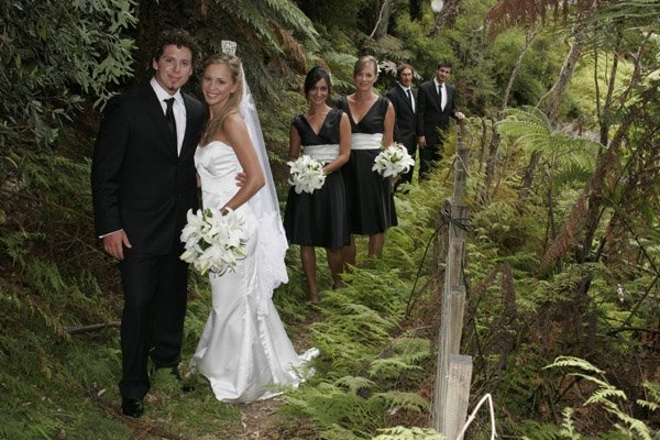
As an aside example, I was a bit paranoid about looking back on my wedding photos and regretting my fashion decisions, so I really wanted to go as classic as possible. I was a bit scarred by looking at some peoples 80s wedding pics and thinking, eeek! I didn't want to look back and think OMG what was I thinking. So I didn't want to be too fashionable and wanted to keep things classic. I believe nothing is more classic than black and white.

My wedding day 2008, our good looking bridal party in classic black and white
 
And like the leopard print and green combo from a previous post, this colour combo is also endorsed by nature. Just think friesian cows, zebras and my super cute kitty Bambino.


Image courtesty of http://photos-for-you.com/


Image courtesy of jukani.co.za


Image courtesy of weheartit.com


My baby boy Bambino is naturally and beautifully monochrome

So for a high contrast visual pleasure that nature endorses and can serve you very well in terms of being difficult to get wrong - go monochromatic. I bet you have loads of black and white pieces in your wardrobe right now, so go get them all out and mix and match. Have fun xxx


Proudly designed by Mlekoshi playground