Showing posts with label colour blocking. Show all posts

Colour blocking: A pop of colour to brighten the mood

Wednesday, 26 June 2013


I don't know about you but on a cold day like it is here today in New Zealand I need a bit of colour to brighten the mood!

ORANGE AND ROYAL BLUE

Let's face it, colour blocking isn't a new trend in fact we've written about it before and it has probably been reinvented so many times with a new 'seasonal colour to watch' that I'm hardly breaking new ground here.  But without dwelling on a particular colour I am instead choosing to pay homage to a pop of colour in every shade that I feel really brings a smile to my dial and brings oomph to any room!

PURPLE

I must have gone out and bought at least 4 new shades of bold nail polish in the last two weeks (considering I don't wear nail polish this is pretty significant!).  The bold rich hues of burgundy, merlot, blood red and mauve are so inviting that I've been prepared to brave a wonky right hand just for the privilege of having dramatic colour on my cuticles.  Sometimes a lick of nail polish is all you need to feel like you've done something 'electric' with your look - and for 'naked nail types' like myself it can be quite an uplifting change!

EMERALD GREEN

 How much fun is this room now that the bed is green and not brown!  Unexpected yet captivating!

PINK ACCENTS
 From left to right: decor8blog.comwww.soniaroselli.com

Recently I've been transfixed by instagram pics of bright bold pink lipstick,  not to mention shots of pink on duvet covers, velvet cushions and mink throws and as I am a girly girl at heart and love pink, I'm going with it.  When normally I would reach for my favourite red lippy (Poppy Cream by Elizabeth Arden) as a 'look at me' lip colour I instead purchased 'Pout Paste' by Australis in a hot pink similar to the one Emma Stone is wearing - its a really glossy shiny pink stain (not great on a windy day) but I instantly loved it.  So much so that I've taken to wearing it during the day (after all it is a gloss) - and you only live once right!  Having said that, a touch of pink really is quite timeless in the right context.  Just like there is a shade of pink for every home there is a shade of pink for every pout!

PINK AND BLACK

From left to right: followpics.com & fashion.about.com


BLACK AND YELLOW

For the home, yellow and grey have always been a match made in heaven, its almost as if the grey has a calming effect on the yellow and softens its impact.  While black on the other hand makes the yellow stand out even more as if  vying for attention.  I especially love the culotte's in the first fashion pic, how amazing do those pants look? - yes you probably do need a super high heel or long limbs to have the same effect but if you're shorter, a yellow skirt would have the same effect.  Love it, this makes me smile!

What are you wearing this season that makes you smile whenever you wear it? I bet it's bright and bold.  Sometimes we need a pop of colour to brighten the mood and assert our personalities whether that be at home or on the street :-)

And if you don't wear bright colours very much, try it, you just might like it!


How to mix prints

Tuesday, 2 April 2013

Left to right imagery: stylingon.com & designspiration.net


Mixing prints takes a bit of courage and an eye for colour combinations.  On the home front a combination of prints can be very chic and the overall feel can bring a plain or lifeless room to life.  On the fashion front it can give someone a real sense of personality...


Something for everyone - Image by theberry.com


My personal approach to print is one that is relatively reserved but what I love about mixing prints is that it doesn't always have to say 'hey look how many colours I can wear' - but rather, 'look what I can do with multiple prints and colour', take for instance these runway looks that are mixing prints yet in a monochromatic way.


Image from style.mtv.com


The overall look above is a look that is refined yet captivating as not only are the models mixing prints but they are mixing textures in a tonal colour palette of greys black and brown. Not once do I think this is too much print, which just goes to show that mixing prints can be refined and subtle.


Even if you are someone who likes to keep your colour scheme simple inside the home, introducing several different prints into an otherwise neutral space like for instance in window dressings or cushions (as above) shows a bit of flare yet is easily replaced should your relationship with the print sadly 'come to an end'.


Left to right: youareherefw.com and cosy.pt


Sometimes too much of something can be a wonderful thing like for instance this leopard on leopard look or this over the top zebra wallpaper.  Sometimes if you have the right oomph of colour to offset the print the scheme can just work - it shouldn't but it does, like these further examples


Micro-floral meets green zebra: greathomeinterior.com


The yellow floral is offset by a striking zebra print: asiankoreanfashion.com


Mixing prints can tread a fine line between creating a beautiful mess and an amazing fashion moment.  These celebs seem to get the balance right


Whitney Port, tartan and stripes myfashavenue.com


Scarlett mixes her black and white prints: olivekelly.blogspot.com


Miranda in double floral - lamodellamafia.com


Leopard and floral - who knew?: Olivia enpaper.blogspot.com


Mixing print the right way is all about maintaining balance and having the confidence to do it in the first place.  Occasionally it can be a happy coincidence that you were wearing 3 kinds of stripes and it looked fab but for the most part this is a blend that takes some coordination - there needs to be a common thread.  Either you try bold print with bold solid colours to offset, or you blend prints with tonal accessories which compliment rather than contrast.  The best thing about mixing prints is it really does get your imaginative juices flowing and when you strike it lucky - it can be a winning combination.

Have a go, I dare you!


Colour Blocking

Wednesday, 11 July 2012

Outfit pic: By Lindsay Keats - Dress and bag from Glassons, Shoes from Nude 
Interior pic: courtesy of Design Interior Blog


I love how simple yet effective colour blocking is. It can create a fantastic visual impact that is bold, dynamic and fun for your outfits and home interiors. With the teal as the primary colour and adding complementary accessories in pink and yellow, it really makes the outfit pop. Was quite happy to find this similar interior colour block image with the vibrant teal walls and the pink touches.

So how do you choose the colours? This doesn’t simply mean that you put two or three bold colours together, they must be complementary. Here is a great guide from style prompt on how to technically figure out which colour combinations work best together.

As we’ve done with this outfit, you can also try colour blocking with homeware accessories such as cushions, vases or throws.


Colour block with accessories - image from getinmyhome

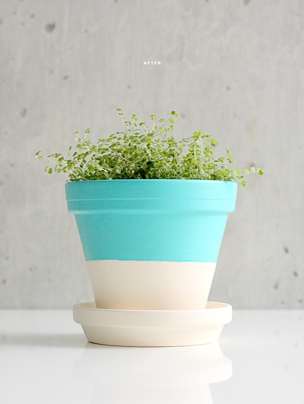
If you're into DIY, here is a fun colour blocking project for your home pot plants from Dellie. 

http://www.dellie.ca/blog/2012/04/30/diy-terracotta-plant-pots/
DIY your own colour block terracotta pot plant


Or if you're like me and would rather just buy things 'ready made' check out these lovely 'dipped' bowls from Wind & Willows below.

Wind & Willow Home create beautiful 'dipped' products


Well very first blog post done! Hope you enjoyed it, we look forward to your feedback.

Thanks for reading!
Mereana & Erena


Proudly designed by Mlekoshi playground