Guest Post: Latest design trends at the world famous Spazio Rossana Orlandi

Monday, 26 May 2014

Rossana Orlandi 

Home Becomes Her is excited to welcome our first guest blogger Amandine Dowle. Amandine is a talented French photographer working in the Italian fashion industry and is keen to share with us her unique point of view on fashion and interior design.

Rossana Orlandi is an international icon since buying an old factory in Milan in 2002 that she then transformed into a huge three floors of gallery space exhibiting the most imaginative emerging worldwide designers like Jaime Hayon, Piet Hein Eek, Nacho Carbonell and many others.

This short woman seems to come out of  an old movie from the sixties. Wearing huge white glasses that practically cover her tiny face, she is a courageous and brave woman with an amazing sense of humor. Starting as a fashion designer, she developed her taste and started to promote limited edition design-art. With a good nose for originality, she is called “one of the design world’s most influential patrons” by the Financial Times How To Spend It magazine.

“WE WORK WITH PEOPLE WHO CAN SELF-PRODUCE. AND I ALWAYS KEEP THE PROTOTYPES – THEY’RE MY FAVOURITES – THEY’RE OFTEN SO BEAUTIFUL. IT’S IMPORTANT TO BE REALLY OPEN TO ALL IDEAS. I AM ALWAYS CURIOUS, ALWAYS LEARNING.”
ROSSANA ORLANDI


Let me guide you to her amazing and unique gallery. Close to the station Porta Venezia in Milan, the Spazio Rossana Orlandi is located in one of the prettiest areas of the city. You get to the gallery by passing by the garden exhibiting itself rare pieces of art: lamps, mirrors, chairs, little objects, and sculptures everywhere. It is like entering to Alice’s world in wonderland!


Then you take the interior staircase that leads you to three different floors. Each floor displays different atmosphere divided in several rooms.


Here is a selection of products that I like:


The “Peacock” chair designed by by Eiri Ota and Irene Gardpoit Chan represents a natural instance as a flower blossoming or a bird’s tail in a ritual courtship. The chair has been made from acrylic composites stretched by hand. The process is involving manipulating a single sheet within minutes. The result is just beautiful!


The sculpture “sugar” designed by the Dutch artist Aldo Bakker. It has impressed me for the unreality of the stainless steel tableware that stays on a thin mountain of brown sugar.


The last ones “Ripple Light” by the London studio Poetic Lab are lamps that are projecting waves of water on walls. It gives you a sensation of relaxation, wellness and serenity.


The spazio Rossana Orlandi is far my favorite gallery that I have seen so far. I highly recommend the visit while visiting Milan to get as many interior design ideas as possible!

M.A.C Candy Yum Yum

Saturday, 12 April 2014

Fashion in the vines - image via stuff.co.nz
This summer I entered the Fashion in the vines competition at the Marlborough Wine and Foods Festival. I came third in this Trelise Cooper Coop dress which Erena helped me choose and style. It was such a fun day of wine tasting, great food and awesome memories with great friends.

The hubby and I enjoying our day. A very important part of the outfit is the lipstick! M.A.C - Candy Yum Yum Matt Lipstick, super bright fluro pink! I've decided to make this post all about the PINK! 
M.A.C Candy Yum Yum Matt lippie, wear it and people cant help but comment, its not a shy colour

A beautiful lady showing off close up this lipstick colour
Image via Pinterest.com

A lot of my friends balk at the idea of pink in interiors, but just like Candy Yum Yum lippie you can add pink in a small thoughtful way to create a pretty impact.


Bright pink leather pouf in our living room adds just a touch of pink yumminess


Pink and turquoise such complimentary colors.
Image via cushandnooks.blogspot.co.nz

For a bold statement baby pink walls, again with greens and turquoise it is a nice balance
Image via sfgirlbybay.com

This hot pink unit is so bold, I love how it screams "look at me!"
Image via desiretoinspire.net

Softer blues and pinks, love the retro prints and mid-century furniture style
Image via weheartit.com

These fashion picks show just how nicely hot pink and turquoise go together. Its a stand out playful combo...

Image via marilynsclosetblog.blogspot.com.es
Image via Pinterest.com

Image courtesy of stephanie-bradshaw.com
Inspiration can come from anywhere, even your favorite new lipstick. Cheaper than a new outfit, I highly recommend you grab a new lipstick color and totally transform your look.

Modern Monochrome and Mustard Bathroom

Tuesday, 11 March 2014

Our Modern Monochrome and Mustard Bathroom
After months of planning and five weeks of building, tiling, plumbing and electrical work, our new bathroom is complete. We’re thrilled with the finished product and feel so lucky to get to use it every day.  I love a good before and after sequence so here we go!

The BEFORE bathroom pic

The AFTER bathroom pic

I’m sure you’ll agree that this one offers a very dramatic change. The configuration has been completely transformed and the only thing in the same position is the bath. In the same space we've managed to maximise features to also include a new laundry and separate shower. No longer do I have to stand in the tub to shower!

We debated at length about the black tiles as it is quite a bold and dramatic statement, but seeing the finished product, we have no regrets and love the shiny high-gloss black tiles. The running bond tile pattern and white grout highlight the subway tile shape and provides a bit of drama as it really makes the shape and pattern quite pronounced.  The high gloss shine tiles and cabinets  reflect the light around the room making it feel brighter and bigger. Although the room is very modern with clean lines, the subway tile shape is quite traditional and links to the retro theme through the rest of the house as it is a historical design re-purposed in a modern and  fashionable way.


The traditional subway tile. Image from skyscrapercity.com


We chose the floating vanity, cupboard and toilet to give a lighter and more spacious feeling. Losing that connection to the ground helps gives give a visual illusion of space as opposed to that heavy grounded and closed in feeling if we were to get units all the way to the floor.


Accessories soften the strong design features and give some warmth and personality.


The grey floor tiles help soften the extreme and bold contrast of the black and white walls. They also introduce a more organic and textured element to the space that is otherwise dominated by the modern, cool and harsh monochrome. The wooden floating shelves also provide some natural softness to balance the rooms cool hardness.


As accent colors we've introduced just a hint of mustard, gold and green in the art and accessories. With such a stark monochromatic blank palette it was important to bring in some shots of color.


Our luxurious Citta towels are the perfect color and I love the retro pattern which ties into the rest of our retro home and again offers some interest and contrast to the otherwise very modern and sleek space.


Original bathroom entry, is now a laundry cupboard


The AFTER pic, clean, white and fresh


Space economical, all you need for your laundry is a cupboard


I created this mood board on Polyvore, see here to purchase the items displayed
This was my original mood board made in Polyvore which was quite spot on in terms of the color palette even though I didn't use any of the light fittings, the feeling is very close. I would recommend using a mood board to get a good picture of what look and style you're trying to achieve. There are so many great tools out there to help you create one, my favs are Polyvore and Pinterest and if you're trying to choose colors try Design Seeds for finding a palette just right for you.


I want to give a special thanks to our talented team of tradesmen who turned this dream into a reality.

Danny – Best builder ever
Herb – Best tiler ever
Stefan – Best architect (and husband) ever

Thanks team, getting clean never felt so good!

Now to balance out this post here are some Monochrome and Mustard looks to steal...

Image from shop-hers.com 


Image from socialbliss.com


Image from whowhatwear.com


Image from celebitchy.com

Until next time x

Dotty

Tuesday, 4 March 2014

Two of my favorite trends at the moment dots and metallic! Loving the decals, fun and easy to do.
Interior image from Lauren Conrad

Polka dots, dots, and spots whatever you may call them they don’t really seem to ever go out of fashion, but rather have resurgences into popularity. In women’s fashion they have a very fun and youthful image, which could be because they were made famous by Minnie Mouse’s red and white dress back in the 1920’s. However dots can also be very sophisticated and fashion forward as some of the examples in this post demonstrate.

Polka-dots go way back in time with this example of Marilyn Munroe in the 50s
Image from Hunting in Heels

Fast forward to the present day and this is one of the most elegant examples of polka dots I could find. By far a monochrome black and white polka dot pattern seems to dominate celebrity fashion. Emma wears Luca Luca Spring 2012.
Image from posh24.com


Just to make a point about just how sophisticated polka dots can be, Kate Middleton wears this simple but fun and pretty Top Shop maternity dress which sold out instantly after this photo was released.
Image from mycelebrityfashion.co.uk


Lauren Conrad has recently gone crazy for dots with so many dotty examples in her clothing range.
Image from laurenconrad.com

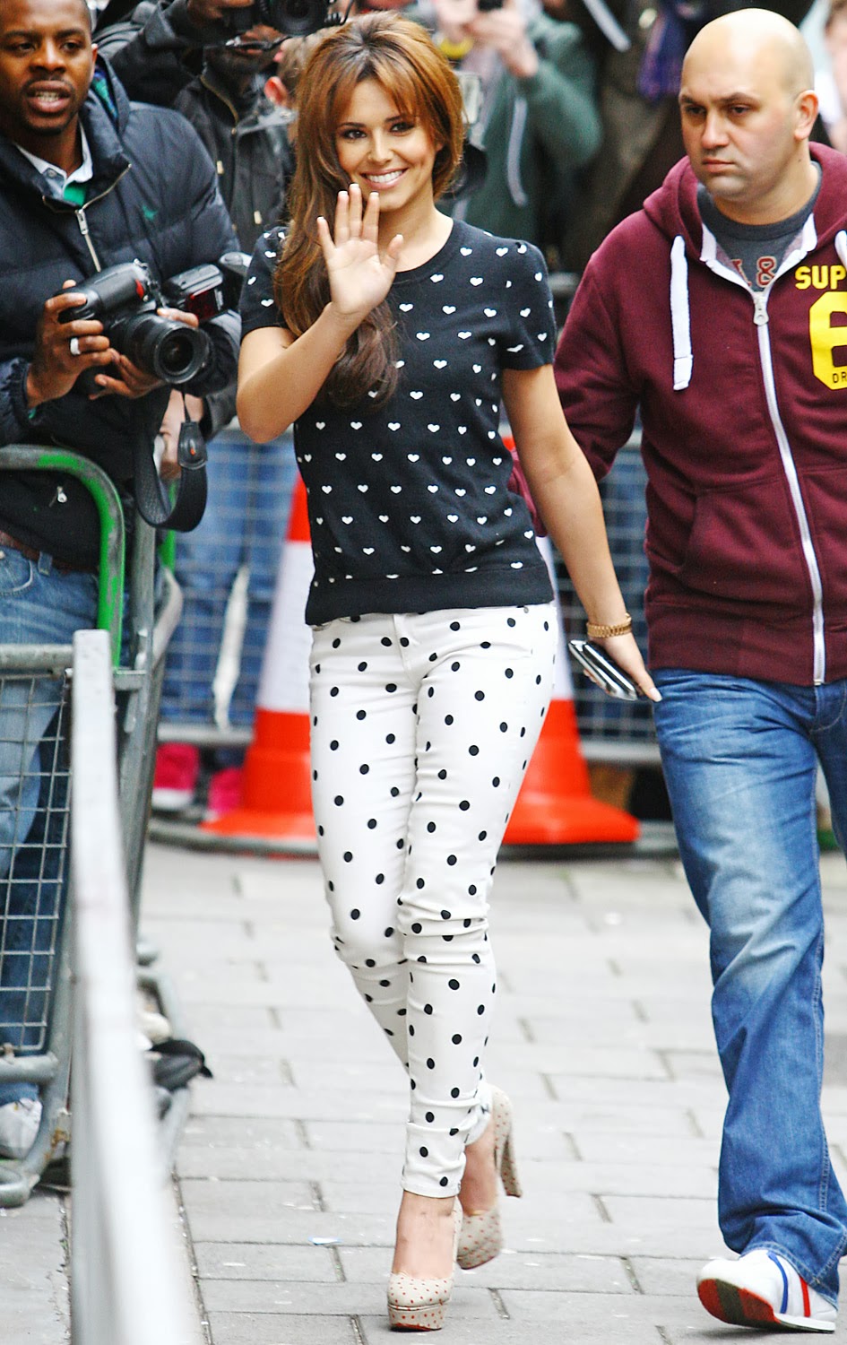
Cheryl Cole goes for the double dot combo, if you look closely her top are actually little sweet hearts, a nice wee dot variation. Again the monochrome version is most popular and easy to wear with this already bold pattern.
Image from usmagazine.com


This post was actually inspired by the Kip and Co bed collection as they are no strangers to using bold graphic prints and I’m loving their dotty range of bed linen and towels.

From the Dappled Dreams Collection comes this fun and funky dotty duvet cover set
Image from kipandco.net.au

From the Dappled Dreams Collection you can also get dotty sheets. These covers and colors have a sort of 80s retro feel.
Image from kipandco.net.au


For a more bold option I'm loving this duvet cover set, accompanied by dotty pillow cases.
Image from kipandco.net.au


The dotty theme continues into their towel range.
Image from kipandco.net.au


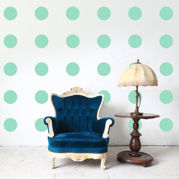
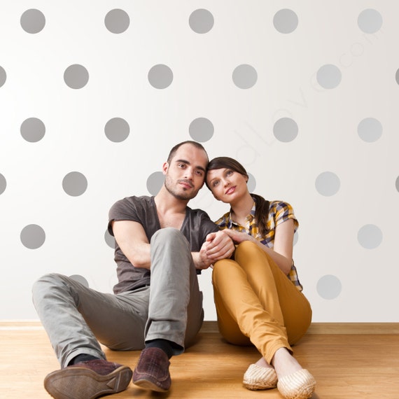
From beds and towels to walls, these decal dots allow you to get creative in any room. You can also experiment with how to place them in a linear fashion as above or more angled as below. They come in every color on Etsy.
Image from Etsy shop WallsNeedLove

Image from Etsy shop WallsNeedLove


And don’t forget the blokes, dots are not just for her and home but they're also for him. You can see the trend embraced in men’s fashion with shirts, ties and scarves sporting the spots. Below are some of my favorite more daring examples.

Latest season of World  Men's fashion is decidedly bold, dapper and sophisticated. The colorful polka dot suit is definitely for the brave Worldly men out there.
Image from World
Style icon Pharrell Williams wears a Comme Des Garcons play polka dot cardigan, not the most macho clothing item, but he makes it work! His cardi makes me happy.
Image from creativeboysclub.com

So for home, her and him there is always a dotty accessory that is perfectly appropriate for the occasion. Even when it fades from the fashion forefront, don’t be afraid to stand by the trend and stand out.


Image courtesy of getinmyhome

Proudly designed by Mlekoshi playground